Identifying key milestones#
This section aims to reproduce the key splitting milestone identification approach
presented in the work of Hlosta et al. [HKZB19]
Keywords: Identifying at-risk students
The approach of Hlosta et al. aims to detect points in time where the paths of successful and unsuccessful students start to split.
Procedure:
Define key performance metrics for students (e.g., number of clicks, assessment scores) and model them as a time series for each student. (e.g., the cumulative number of clicks, cumulative assessment scores, cumulative weighted assessments scores)
Perform statistical tests (e.g., Unpaired t-test, Wilcoxon Rank Sum Test) in each time slice between different groups of students. (e.g., failing student group, succeeding student group)
Compute the splitting value in each time slice that minimizes the split error. (i.e., that maximizes prediction accuracy)
Plot the time-series graph showing at which time slice the first statistically significant difference was detected and the split values.
Martin Hlosta, Jakub Kocvara, Zdenek Zdráhal, and David Beran. Visualisation of key splitting milestones to better support interventions. In 03 2019.
from itertools import combinations

import matplotlib.pyplot as plt
import numpy as np
import pandas as pd
from IPython.display import display
from scipy.stats import levene, norm, probplot, ranksums, shapiro

from oulad import get_oulad

%load_ext oulad.capture
%%capture oulad
oulad = get_oulad()
Cumulative weighted assessments scores#
We use the weighted assessment score for the key performance metric, in this example.
Step 1: Model the metric as a time series for each student#
As in the work of Hlosta et al. we will use the EEE/2014J course.
Note
During merging, we loose 253 students that didn’t submit any assessments.
cumulative_weighted_assessment_score = (
    oulad.student_registration[
        (oulad.student_registration.code_module == "EEE")
        & (oulad.student_registration.code_presentation == "2014J")
    ][["id_student"]]
    .merge(
        oulad.student_assessment.drop(["date_submitted", "is_banked"], axis=1),
        how="inner",
        on="id_student",
    )
    .merge(
        oulad.assessments[
            (oulad.assessments.code_module == "EEE")
            & (oulad.assessments.code_presentation == "2014J")
        ],
        how="inner",
        on="id_assessment",
    )
    .assign(weighted_score=lambda x: x["score"] * x["weight"] / 100)[
        ["date", "id_student", "weighted_score"]
    ]
    .pivot(index="date", columns="id_student", values="weighted_score")
    .fillna(0)
    .cumsum()
    .T.join(
        oulad.student_info[
            (oulad.student_info.code_module == "EEE")
            & (oulad.student_info.code_presentation == "2014J")
        ][["id_student", "final_result"]].set_index("id_student")
    )
    .set_index("final_result", append=True)
)

unstacked_cumulative_weighted_assessment_score = (
    cumulative_weighted_assessment_score.unstack()
)

display(cumulative_weighted_assessment_score)
| 33.0 | 68.0 | 131.0 | 166.0 | ||
|---|---|---|---|---|---|
| id_student | final_result | ||||
| 47061 | Pass | 11.68 | 37.16 | 53.96 | 70.20 |
| 60809 | Pass | 14.56 | 36.40 | 60.48 | 86.80 |
| 62034 | Pass | 14.56 | 38.08 | 55.72 | 55.72 |
| 67539 | Pass | 12.00 | 33.84 | 48.40 | 64.92 |
| 67685 | Pass | 12.00 | 35.52 | 57.36 | 81.72 |
| ... | ... | ... | ... | ... | ... |
| 2654928 | Pass | 14.56 | 38.36 | 61.60 | 83.72 |
| 2663195 | Pass | 14.56 | 38.36 | 61.88 | 84.00 |
| 2681277 | Withdrawn | 15.20 | 15.20 | 15.20 | 15.20 |
| 2686053 | Distinction | 13.76 | 38.12 | 63.04 | 87.12 |
| 2686712 | Fail | 16.00 | 42.32 | 42.32 | 42.32 |
935 rows × 4 columns
Step 2: Perform statistical tests#
Let’s first check whether we can use the Unpaired t-test.
Unpaired t-test#
Assumptions#
Spoilers
Assumptions fail for the t-test. We can skip to the Wilcoxon rank-sum test.
Independence of the observations
Each student belongs to only one group (Distinction, Pass, Fail, Withdrawn).
There is no relationship between students in each group. (We assume that the
final_resultof a student does not depend on thefinal_resultof other students)
Absence of outliers (see box plot and outlier count below)
Normality (each group should be normally distributed, see Shapiro-Wilk test below)
Homoscedasticity (homogeneity of variances - the variance within the groups should be similar, see Levene test below)
Detecting outliers visually#
cumulative_weighted_assessment_score.boxplot(by="final_result", figsize=(14, 12))
plt.show()
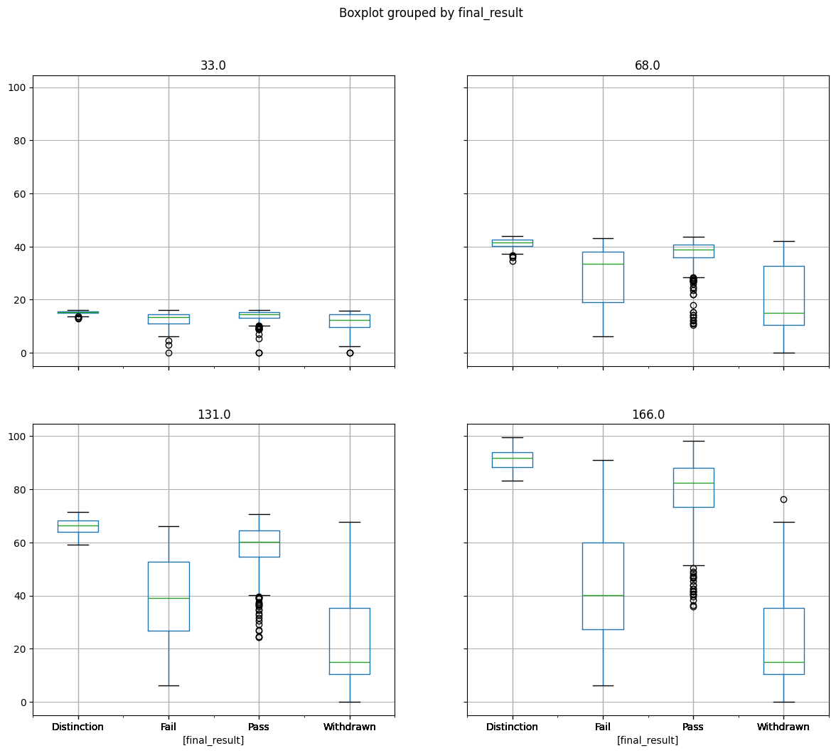
We can see quite a few outliers, notably in the Pass student group.
Detecting extreme outliers statistically#
Let’s verify whether there are any extreme outliers (above Q3 + 3xIQR or below
Q1 - 3xIQR).
A quick reminder:
Q1 is the first quantile = the value that is greater than 25% of the data
Q3 is the third quantile = the value that is greater than 75% of the data
IQR is the Interquartile Range = Q3 - Q1
extremes = (
    unstacked_cumulative_weighted_assessment_score.quantile([0.25, 0.75])
    .T.assign(IQR=lambda x: x[0.75] - x[0.25])
    .assign(
        lower_extreme=lambda x: x[0.25] - 3 * x["IQR"],
        upper_extreme=lambda x: x[0.75] + 3 * x["IQR"],
    )[["lower_extreme", "upper_extreme"]]
)

bigger = unstacked_cumulative_weighted_assessment_score > extremes.upper_extreme
smaller = unstacked_cumulative_weighted_assessment_score < extremes.lower_extreme
total = bigger.sum().sum() + smaller.sum().sum()

print(
    f"The number of extreme outliers (N={total}) represents "
    f"{100 * total / cumulative_weighted_assessment_score.count().sum():.2f}"
    f"% of the dataset (N={cumulative_weighted_assessment_score.count().sum()})"
)
The number of extreme outliers (N=21) represents 0.56% of the dataset (N=3740)
We suspect that the number of outliers might bias the test. However, as their proportion is relatively small (0.56%) and the dataset is quite large (3740), we assume that the impact of the bias will be limited.
Examine normality visually#
Let’s plot a histogram to inspect the distribution visually.
for arr in cumulative_weighted_assessment_score.hist(figsize=(12, 6)):
    for ax in arr:
        scores = cumulative_weighted_assessment_score[float(ax.title.get_text())]
        ax = ax.twinx()
        scores.plot(kind="kde", legend=False, ax=ax, color="red")
        ax.set_xlim(*scores.agg(["min", "max"]).values)
        x = np.linspace(*ax.get_xlim(), 100)
        y = norm.pdf(
            x, **scores.agg(["mean", "std"]).set_axis(["loc", "scale"]).to_dict()
        )
        ax.plot(x, y, color="green")
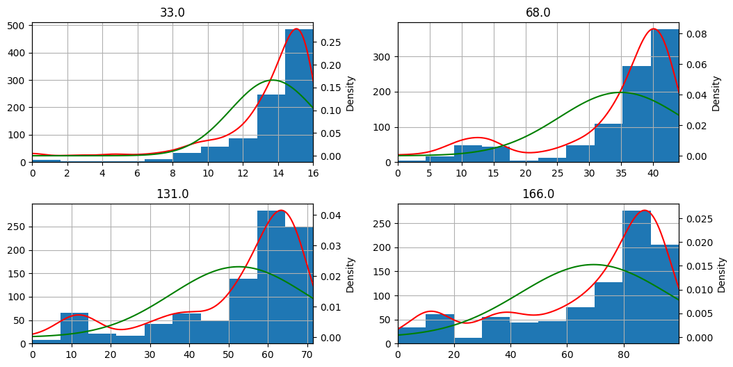
We notice that the shape of the distribution (blue histogram / red density) is quite different from the normal bell curve (in green).
Another option might be to plot probability plots that show how much our distributions follow the normal distribution.
fig, axes = plt.subplots(nrows=2, ncols=2, figsize=(10, 6), constrained_layout=True)
probplot(cumulative_weighted_assessment_score[33.0], dist="norm", plot=axes[0, 0])
probplot(cumulative_weighted_assessment_score[68.0], dist="norm", plot=axes[0, 1])
probplot(cumulative_weighted_assessment_score[131.0], dist="norm", plot=axes[1, 0])
probplot(cumulative_weighted_assessment_score[166.0], dist="norm", plot=axes[1, 1])
plt.show()
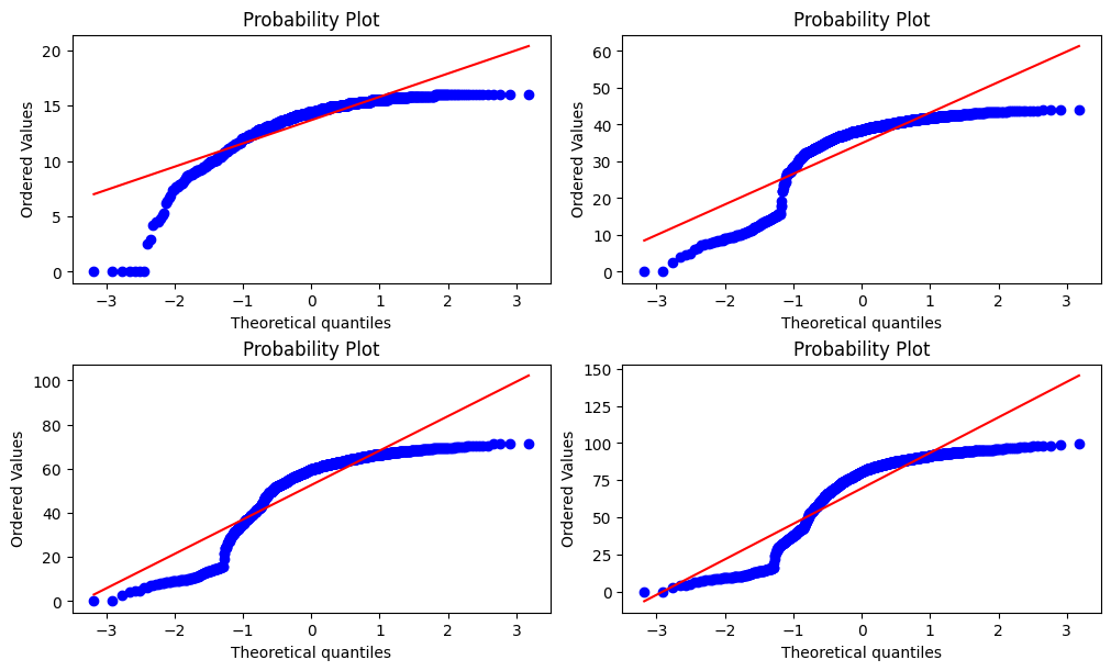
Here too, we notice that the distribution deviates from the theoretical quantiles and thus seems to be not normal.
Examine normality with the Shapiro-Wilk test#
The Shapiro-Wilk normality test tests the null hypothesis H0=”the distribution is normally distributed” against H1=”the distribution is not normally distributed”.
Thus, the null hypothesis is rejected if the p-value is less or equal to a chosen alpha level which means that there is evidence that the tested data are not normally distributed.
cumulative_weighted_assessment_score.agg(
    lambda x: shapiro(x).pvalue <= 0.05
).rename_axis("date").reset_index(name="H0 rejected")
| date | H0 rejected | |
|---|---|---|
| 0 | 33.0 | True |
| 1 | 68.0 | True |
| 2 | 131.0 | True |
| 3 | 166.0 | True |
The Shapiro-Wilk test indicates evidence that the distributions are not normally distributed.
At this stage, we fail to satisfy the required assumptions for an Unpaired t-test because the t-test requires normality to assure that the sample mean is normal.
However, the dataset is large (3740), and thus the Central limit theorem applies, which means that the sample mean will follow a normal distribution.
Thus, we assume that the normality requirement is satisfied in this case.
Verifying equal variances with the Levene test#
Finally, let’s test the homogeneity of variance using the Levene test.
The Levene test tests the null hypothesis H0=”groups have equal variances” against H1=”the variances are different”.
Thus, if the p-value is less or equal to a chosen alpha level, the null hypothesis is rejected, and there is evidence that the group variances are different.
cumulative_weighted_assessment_score.agg(
    lambda x: levene(*[row[~np.isnan(row)] for row in x.unstack().T.values]).pvalue
    <= 0.05
).rename_axis("date").reset_index(name="H0 rejected")
| date | H0 rejected | |
|---|---|---|
| 0 | 33.0 | True |
| 1 | 68.0 | True |
| 2 | 131.0 | True |
| 3 | 166.0 | True |
The Levene test indicates that there is evidence that the variances are different.
Conclusion#
We conclude that assumptions for an Unpaired t-test are not satisfied as the variances are different.
Let’s use another test instead, which does not require the homogeneity of variance.
Wilcoxon rank-sum test#
The Wilcoxon rank-sum test tests the null-hypothesis H0=”the distributions are equal” against H1=”values in one distribution are more likely to be larger than the values in the other distribution”.
Thus, if the p-value is less or equal to a chosen alpha level, the null hypothesis is rejected, and there is evidence that the distributions are different.
Assumptions#
Independence of the observations
Values are at least ordinal (ordering/sorting them makes sense)
The dataset satisfies the Wilcoxon rank-sum test assumptions.
Applying the test#
We apply the Wilcoxon rank-sum test for each combination of final_result (e.g.,
Pass-Fail, Pass-Withdrawn, etc.) and for each time-slice (date) (33, 68, etc.)
significance = np.zeros(
    (
        cumulative_weighted_assessment_score.shape[1],
        unstacked_cumulative_weighted_assessment_score.shape[1],
    ),
    dtype=bool,
)

for offset, date in enumerate(cumulative_weighted_assessment_score):
    df = unstacked_cumulative_weighted_assessment_score[date]
    columns = df.columns
    offset *= len(columns)
    for i, j in combinations(range(len(columns)), r=2):
        significance[i, j + offset] = significance[j, i + offset] = (
            ranksums(df.iloc[:, i], df.iloc[:, j], nan_policy="omit").pvalue <= 0.05
        )

significance_df = (
    pd.DataFrame(
        significance,
        index=unstacked_cumulative_weighted_assessment_score.columns.levels[1],
        columns=unstacked_cumulative_weighted_assessment_score.T.index,
    )
    .rename_axis("")
    .rename_axis(["", "H0 rejected"], axis=1)
)

display(significance_df)
| 33.0 | 68.0 | 131.0 | 166.0 | |||||||||||||
|---|---|---|---|---|---|---|---|---|---|---|---|---|---|---|---|---|
| H0 rejected | Distinction | Fail | Pass | Withdrawn | Distinction | Fail | Pass | Withdrawn | Distinction | Fail | Pass | Withdrawn | Distinction | Fail | Pass | Withdrawn |
| Distinction | False | True | True | True | False | True | True | True | False | True | True | True | False | True | True | True |
| Fail | True | False | True | False | True | False | True | True | True | False | True | True | True | False | True | True |
| Pass | True | True | False | True | True | True | False | True | True | True | False | True | True | True | False | True |
| Withdrawn | True | False | True | False | True | True | True | False | True | True | True | False | True | True | True | False |
As in the work of Hlosta et al. the hypothesis test indicates a significant difference between the groups in the time slices, starting from the first time slice (the assessment from day 33).
We also note that the test did not reject the null hypothesis for the (Withdrawn-Fail) couple in the first time slice (33), indicating that there is not enough evidence to conclude the distributions to be different.
Step 3: Compute the splitting value#
This step tries to compute the splitting value in each time slice that minimizes the split error (i.e., maximizes the number of correct predictions).
We intend only to separate Passing students from Failing students. Therefore we re-label students that had Withdrawn from the course as Failing and re-label those that had succeeded exceptionally well (Distinction) as Passing students.
Warning
We are still working on this part! Our current implementation follows a naive approach!
splitting_values = []

for date in cumulative_weighted_assessment_score.columns:
    df = cumulative_weighted_assessment_score[date]
    index = df.index.get_level_values(1).values
    index[index == "Distinction"] = "Pass"
    index[index == "Withdrawn"] = "Fail"

    unique_values = np.sort(df.unique())
    max_score = 0  # pylint: disable=invalid-name
    result = {}
    for value in unique_values:
        separator = df < value
        # We suppose Fail score < Pass score
        score = (index[separator] == "Fail").sum() + (index[~separator] == "Pass").sum()
        if score > max_score:
            max_score = score
            result = {
                "score": round(
                    max_score / cumulative_weighted_assessment_score.shape[0], 2
                ),
                "separator": value,
            }

    splitting_values.append(result)

splitting_values = pd.DataFrame(
    splitting_values, index=cumulative_weighted_assessment_score.columns.astype(float)
)
display(splitting_values)
| score | separator | |
|---|---|---|
| 33.0 | 0.78 | 11.04 |
| 68.0 | 0.83 | 26.72 |
| 131.0 | 0.89 | 42.48 |
| 166.0 | 0.91 | 53.40 |
We note that although we get results of similar quality, there are some differences.
For instance, in the work of Hlosta et al. the obtained splitting values were around
[13, 20, 40, and 55]
Step 4: Plot the time-series graph#
Finally, let’s plot the results.
ax = splitting_values["separator"].plot(
    color="black",
    linewidth=4,
    figsize=(12, 8),
    title="Cumulative assessment score by student final_result",
    xlabel="Day",
    ylabel="Cumulative assessment score",
)

mean_and_quartiles = (
    cumulative_weighted_assessment_score.groupby("final_result")
    .agg(
        [
            ("mean", "mean"),
            ("first_quartile", lambda x: np.percentile(x, 25)),
            ("third_quartile", lambda x: np.percentile(x, 75)),
        ]
    )
    .T.reorder_levels(order=[1, 0])
    .unstack()
)


def fill_between_plot(label, color, values):
    """Plots a matplotlib `fill_between` plot in the given axis."""
    ax.plot(values.index.astype(float), values["mean"], label=label, color=color)
    args = [values.index.astype(float), values.first_quartile, values.third_quartile]
    ax.fill_between(*args, color=color, alpha=0.3)


fill_between_plot("Distinction", "green", mean_and_quartiles["Distinction"].T)
fill_between_plot("Pass", "blue", mean_and_quartiles["Pass"].T)
fill_between_plot("Fail", "red", mean_and_quartiles["Fail"].T)
fill_between_plot("Withdrawn", "orange", mean_and_quartiles["Withdrawn"].T)
plt.legend()
plt.show()
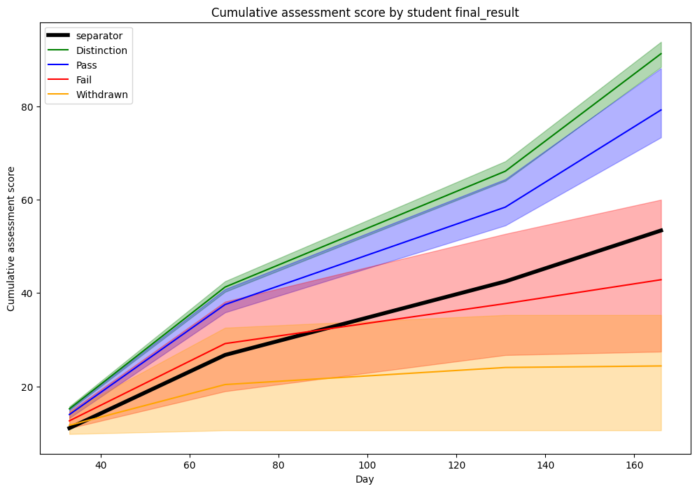
Here too, we get similar graphs.
We note from this visualization that a clear distinction can be made between
Distinction/Pass and Fail/Withdrawn students if only considering the 25 and
75 percentile.
However, it might seem surprising why the splitting line is positioned that low.
Let’s plot the same graph and replace the 25/75 percentiles with 0/100 (i.e., min/max) percentiles.
ax = splitting_values["separator"].plot(
    color="black",
    linewidth=4,
    figsize=(12, 8),
    title="Cumulative assessment score by student final_result",
    xlabel="Day",
    ylabel="Cumulative assessment score",
)

mean_and_quartiles = (
    cumulative_weighted_assessment_score.groupby("final_result")
    .agg(
        [
            ("mean", "mean"),
            ("first_quartile", lambda x: np.percentile(x, 0)),
            ("third_quartile", lambda x: np.percentile(x, 100)),
        ]
    )
    .T.reorder_levels(order=[1, 0])
    .unstack()
)

fill_between_plot("Distinction", "green", mean_and_quartiles["Distinction"].T)
fill_between_plot("Pass", "blue", mean_and_quartiles["Pass"].T)
fill_between_plot("Fail", "red", mean_and_quartiles["Fail"].T)
fill_between_plot("Withdrawn", "orange", mean_and_quartiles["Withdrawn"].T)
plt.legend()
plt.show()
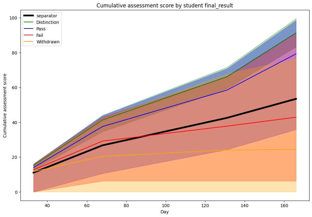
We note that there is much more overlapping if considering the extremes. This might explain why the splitting line was lower than expected previously, as it tries to balance the tradeoff between passing students with a lower score and failing students with a higher score.
Cumulative number of clicks#
We use the number of clicks in the VLE (Virtual Learning Environment) for the key performance metric.
We follow the same steps as in the first example.
Step 1: Model the metric as a time series for each student#
As in the work of Hlosta et al. we will use the EEE/2014J course.
Note
During merging, we loose 91 students that haven’t interacted with the VLE.
cumulative_click_count = (
    oulad.student_registration[
        (oulad.student_registration.code_module == "EEE")
        & (oulad.student_registration.code_presentation == "2014J")
    ][["id_student"]]
    .merge(
        oulad.student_vle[
            (oulad.student_vle.code_module == "EEE")
            & (oulad.student_vle.code_presentation == "2014J")
        ][["id_student", "date", "sum_click"]],
        how="inner",
        on="id_student",
    )
    .groupby(["id_student", "date"])
    .agg("sum")
    .join(
        oulad.student_info[
            (oulad.student_info.code_module == "EEE")
            & (oulad.student_info.code_presentation == "2014J")
        ][["id_student", "final_result"]].set_index("id_student")
    )
    .set_index("final_result", append=True)
    .unstack(level=1)
    .fillna(0)
    .cumsum(axis=1)["sum_click"]
)
display(cumulative_click_count)
| date | -18 | -17 | -16 | -15 | -14 | -13 | -12 | -11 | -10 | -9 | ... | 260 | 261 | 262 | 263 | 264 | 265 | 266 | 267 | 268 | 269 | |
|---|---|---|---|---|---|---|---|---|---|---|---|---|---|---|---|---|---|---|---|---|---|---|
| id_student | final_result | |||||||||||||||||||||
| 46048 | Withdrawn | 0.0 | 0.0 | 0.0 | 0.0 | 0.0 | 0.0 | 0.0 | 0.0 | 0.0 | 0.0 | ... | 12.0 | 12.0 | 12.0 | 12.0 | 12.0 | 12.0 | 12.0 | 12.0 | 12.0 | 12.0 |
| 47061 | Pass | 0.0 | 0.0 | 0.0 | 0.0 | 0.0 | 0.0 | 0.0 | 0.0 | 0.0 | 0.0 | ... | 347.0 | 347.0 | 347.0 | 347.0 | 347.0 | 347.0 | 347.0 | 347.0 | 347.0 | 347.0 |
| 60809 | Pass | 0.0 | 0.0 | 0.0 | 0.0 | 0.0 | 0.0 | 0.0 | 0.0 | 0.0 | 0.0 | ... | 2422.0 | 2422.0 | 2422.0 | 2422.0 | 2422.0 | 2422.0 | 2422.0 | 2422.0 | 2422.0 | 2422.0 |
| 62034 | Pass | 28.0 | 28.0 | 28.0 | 28.0 | 28.0 | 28.0 | 28.0 | 28.0 | 28.0 | 28.0 | ... | 1887.0 | 1887.0 | 1887.0 | 1887.0 | 1887.0 | 1889.0 | 1889.0 | 1889.0 | 1889.0 | 1889.0 |
| 67539 | Pass | 0.0 | 19.0 | 19.0 | 26.0 | 26.0 | 26.0 | 26.0 | 26.0 | 26.0 | 26.0 | ... | 1437.0 | 1437.0 | 1437.0 | 1437.0 | 1437.0 | 1438.0 | 1438.0 | 1438.0 | 1438.0 | 1438.0 |
| ... | ... | ... | ... | ... | ... | ... | ... | ... | ... | ... | ... | ... | ... | ... | ... | ... | ... | ... | ... | ... | ... | ... |
| 2654928 | Pass | 29.0 | 35.0 | 46.0 | 46.0 | 46.0 | 46.0 | 46.0 | 46.0 | 46.0 | 46.0 | ... | 1784.0 | 1784.0 | 1784.0 | 1784.0 | 1784.0 | 1784.0 | 1785.0 | 1785.0 | 1785.0 | 1785.0 |
| 2663195 | Pass | 0.0 | 0.0 | 0.0 | 0.0 | 0.0 | 0.0 | 0.0 | 0.0 | 0.0 | 0.0 | ... | 1112.0 | 1112.0 | 1112.0 | 1112.0 | 1112.0 | 1112.0 | 1112.0 | 1112.0 | 1112.0 | 1112.0 |
| 2681277 | Withdrawn | 0.0 | 0.0 | 0.0 | 0.0 | 3.0 | 3.0 | 3.0 | 3.0 | 3.0 | 3.0 | ... | 166.0 | 166.0 | 166.0 | 166.0 | 166.0 | 166.0 | 166.0 | 166.0 | 166.0 | 166.0 |
| 2686053 | Distinction | 7.0 | 7.0 | 12.0 | 12.0 | 17.0 | 20.0 | 20.0 | 20.0 | 20.0 | 30.0 | ... | 2332.0 | 2332.0 | 2334.0 | 2334.0 | 2335.0 | 2335.0 | 2336.0 | 2336.0 | 2336.0 | 2336.0 |
| 2686712 | Fail | 0.0 | 0.0 | 0.0 | 1.0 | 34.0 | 34.0 | 34.0 | 34.0 | 34.0 | 34.0 | ... | 1205.0 | 1205.0 | 1205.0 | 1205.0 | 1205.0 | 1205.0 | 1205.0 | 1205.0 | 1205.0 | 1205.0 |
1097 rows × 288 columns
Step 2: Perform statistical tests#
As in the first example, let’s first check whether we can use the Unpaired t-test.
Unpaired t-test#
Assumptions#
Detecting extreme outliers statistically#
Let’s verify whether there are any extreme outliers (above Q3 + 3xIQR or below
Q1 - 3xIQR).
extremes = (
    cumulative_click_count.quantile([0.25, 0.75])
    .T.assign(IQR=lambda x: x[0.75] - x[0.25])
    .assign(
        lower_extreme=lambda x: x[0.25] - 3 * x["IQR"],
        upper_extreme=lambda x: x[0.75] + 3 * x["IQR"],
    )[["lower_extreme", "upper_extreme"]]
)

bigger = cumulative_click_count > extremes.upper_extreme
smaller = cumulative_click_count < extremes.lower_extreme
total = bigger.sum().sum() + smaller.sum().sum()

print(
    f"The number of extreme outliers (N={total}) represents "
    f"{100 * total / cumulative_click_count.count().sum():.2f}"
    f"% of the dataset (N={cumulative_click_count.count().sum()})"
)
The number of extreme outliers (N=4330) represents 1.37% of the dataset (N=315936)
We note that the outliers ratio is more significant than in the previous example. However, as the number of samples is much more prominent in this case, we also suppose that the impact on the t-test will be limited.
Examine normality#
We skip this step as the number of samples is high, and the central limit theorem applies.
Thus, we assume here too that the normality requirement is satisfied.
Verifying equal variances with the Levene test#
Finally, let’s test the homogeneity of variance using the Levene test.
cumulative_click_count.agg(
    lambda x: levene(*[row[~np.isnan(row)] for row in x.unstack().T.values]).pvalue
    <= 0.05
).rename_axis("date").reset_index(0, drop=True).reset_index(name="H0 rejected")
| index | H0 rejected | |
|---|---|---|
| 0 | 0 | True |
| 1 | 1 | True |
| 2 | 2 | True |
| 3 | 3 | True |
| 4 | 4 | True |
| ... | ... | ... |
| 283 | 283 | True |
| 284 | 284 | True |
| 285 | 285 | True |
| 286 | 286 | True |
| 287 | 287 | True |
288 rows × 2 columns
The Levene test indicates that there is evidence that the variances are different.
Conclusion#
As in the first example, we conclude that assumptions for an Unpaired t-test are not satisfied as the variances are different.
Therefore, we skip to the next test.
Wilcoxon rank-sum test#
Assumptions#
The dataset satisfies the Wilcoxon rank-sum test assumptions. We skip to the next step.
Applying the test#
We apply the Wilcoxon rank-sum test for each combination of final_result (e.g.,
Pass-Fail, Pass-Withdrawn, etc.) and for each time-slice (date) (-18, -17, etc.)
unstacked_cumulative_click_count = cumulative_click_count.unstack()
significance = np.zeros(
    (
        cumulative_click_count.index.levels[1].shape[0],
        unstacked_cumulative_click_count.shape[1],
    ),
    dtype=bool,
)

for offset, date in enumerate(cumulative_click_count):
    df = unstacked_cumulative_click_count[date]
    columns = df.columns
    offset *= len(columns)
    for i, j in combinations(range(len(columns)), r=2):
        significance[i, j + offset] = significance[j, i + offset] = (
            ranksums(df.iloc[:, i], df.iloc[:, j], nan_policy="omit").pvalue <= 0.05
        )

significance_df = (
    pd.DataFrame(
        significance,
        index=unstacked_cumulative_click_count.columns.levels[1],
        columns=unstacked_cumulative_click_count.T.index,
    )
    .rename_axis("")
    .rename_axis(["", "H0 rejected"], axis=1)
)

display(significance_df)
| -18 | -17 | -16 | ... | 267 | 268 | 269 | |||||||||||||||
|---|---|---|---|---|---|---|---|---|---|---|---|---|---|---|---|---|---|---|---|---|---|
| H0 rejected | Distinction | Fail | Pass | Withdrawn | Distinction | Fail | Pass | Withdrawn | Distinction | Fail | ... | Pass | Withdrawn | Distinction | Fail | Pass | Withdrawn | Distinction | Fail | Pass | Withdrawn |
| Distinction | False | True | True | True | False | True | True | True | False | True | ... | True | True | False | True | True | True | False | True | True | True |
| Fail | True | False | True | False | True | False | True | False | True | False | ... | True | True | True | False | True | True | True | False | True | True |
| Pass | True | True | False | False | True | True | False | True | True | True | ... | False | True | True | True | False | True | True | True | False | True |
| Withdrawn | True | False | False | False | True | False | True | False | True | False | ... | True | False | True | True | True | False | True | True | True | False |
4 rows × 1152 columns
The hypothesis test indicates a significant difference in the variance between the groups in the time slices, starting from the first time slice (from the day -18).
Step 3: Compute the splitting value#
As in the first example, in this step, we try to compute the splitting value in each time slice that minimizes the split error between Passing students and Failing students (counting “Distinction” also as “Passing” and “Withdrawn” as “Failing”)
Warning
We are still working on this part! Our current implementation follows a naive approach!
splitting_values = []

for date in cumulative_click_count.columns:
    df = cumulative_click_count[date]
    index = df.index.get_level_values(1).values
    index[index == "Distinction"] = "Pass"
    index[index == "Withdrawn"] = "Fail"

    unique_values = np.sort(df.unique())
    max_score = 0  # pylint: disable=invalid-name
    result = {}
    previous_value = np.nan
    for value in unique_values:
        # Larger interval ==> more speed but less precision
        if value - previous_value < 100:
            continue
        previous_value = value
        separator = df < value
        # We suppose Fail score < Pass score
        score = (index[separator] == "Fail").sum() + (index[~separator] == "Pass").sum()
        if score > max_score:
            max_score = score
            result = {
                "score": round(max_score / cumulative_click_count.shape[0], 2),
                "separator": value,
            }

    splitting_values.append(result)

splitting_values = pd.DataFrame(splitting_values, index=cumulative_click_count.columns)
display(splitting_values)
| score | separator | |
|---|---|---|
| date | ||
| -18 | 0.62 | 0.0 |
| -17 | 0.62 | 0.0 |
| -16 | 0.62 | 0.0 |
| -15 | 0.62 | 0.0 |
| -14 | 0.62 | 0.0 |
| ... | ... | ... |
| 265 | 0.87 | 712.0 |
| 266 | 0.87 | 712.0 |
| 267 | 0.87 | 712.0 |
| 268 | 0.87 | 712.0 |
| 269 | 0.87 | 712.0 |
288 rows × 2 columns
Step 4: Plot the time-series graph#
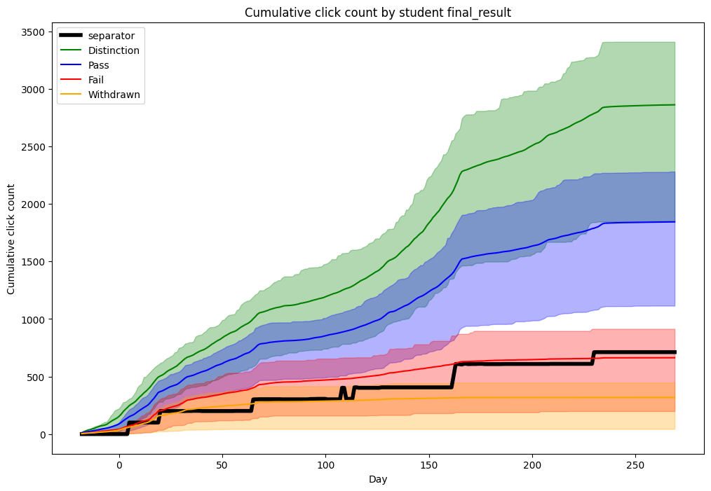
Finally, let’s plot the results.
ax = splitting_values["separator"].plot(
    color="black",
    linewidth=4,
    figsize=(12, 8),
    title="Cumulative click count by student final_result",
    xlabel="Day",
    ylabel="Cumulative click count",
)

mean_and_quartiles = (
    cumulative_click_count.groupby("final_result")
    .agg(
        [
            ("mean", "mean"),
            ("first_quartile", lambda x: np.percentile(x, 25)),
            ("third_quartile", lambda x: np.percentile(x, 75)),
        ]
    )
    .T.reorder_levels(order=[1, 0])
    .unstack()
)

fill_between_plot("Distinction", "green", mean_and_quartiles["Distinction"].T)
fill_between_plot("Pass", "blue", mean_and_quartiles["Pass"].T)
fill_between_plot("Fail", "red", mean_and_quartiles["Fail"].T)
fill_between_plot("Withdrawn", "orange", mean_and_quartiles["Withdrawn"].T)
plt.legend()
plt.show()